
Trappe Digital LLC may earn commission from product clicks and purchases. Rest assured, opinions are mine or of the article’s author.
Photos can make or break a story. Not those lame stock art ones obviously , but some stories can’t be told without the image.
Example: the police officer hug!
Or the fallen soldier returning via O’Hare.
And sometimes they are old photos. For example, of my high school teammate who was killed in the line of duty as a police officer.
And then there’s the age-old problem of sizing for the web – which is different from social media image sizes and very different from what’s needed for print products.
Not interested in this topic? Maybe this is better: Why to never ever use social media logos in your print marketing
I run into image issue all the time writing most of my articles from the mobile WordPress app. I’m currently typing this one out with my thumbs on a flight from Cedar Rapids – Charlotte.
When I upload an image, even when I tell the app to resize it that hardly ever works. After an article publishes I usually have to go to it from the mobile Safari browser and apply the settings again. Interestingly, the images render mostly correctly in my automagic email newsletter that goes to over 1,000.
Get blog posts emailed to you! Ya know, email isn’t dead. 🙂
The more I watch what seems to work and what doesn’t I’m starting to lean toward the strategy of adding images inline and maybe stacked when you have multiple.
[Tweet “”The best mobile strategy is the one that displays content correctly on mobile.” – @ctrappe”]
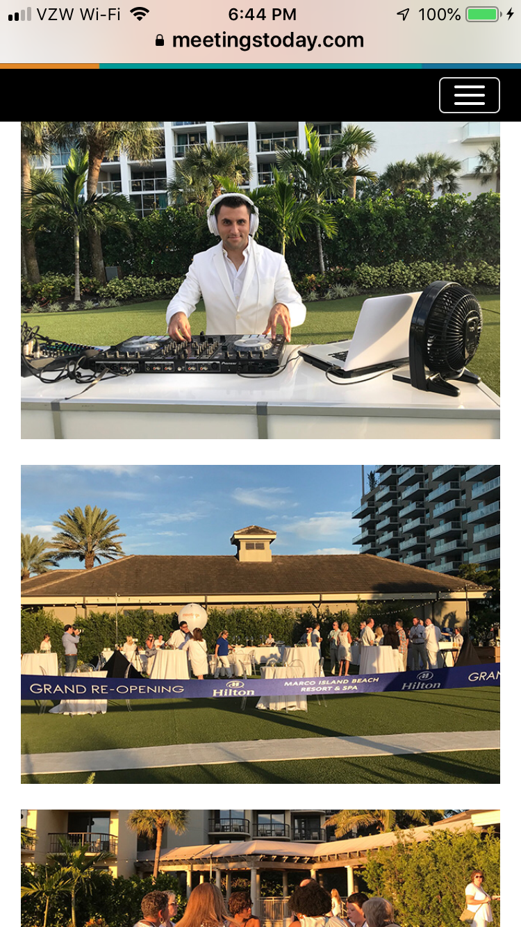
Here’s an example from the crew at Meetings Today – a brand I currently work with:


The article is above those images and once you get to them, they have loaded and it’s easy to scroll through. As a user I find that highly user-friendly. ⭐️ ⭐️⭐️⭐️⭐️
In contrast, here’s an example from a European newspaper that I read. They use the more traditional gallery format.


The galleries are slow to load but the images on top of each other load quickly and are easy to view. You just keep scrolling.
I find the gallery highly user-unfriendly.
There’s other “galleries” that I’ve seen that basically go from page to page for each picture. They often jump around. That gives us marketers more pageviews but the user experience is terrible. Horrible!
Galleries that don’t load or aren’t rendering correctly are no better.
There may be better solutions in the future, but today the way Meetings Today handled it seems to be one of the better solutions. In responsive design those images will look good on all devices and scrolling is already what they are doing when they get to that point in the article. Why make people stop?
Just make sure you checked the images look okay on phones and desktop. As much we I like trying and using new ways of showing content, the simpler way of just stacking photos might be the best here for all devices.